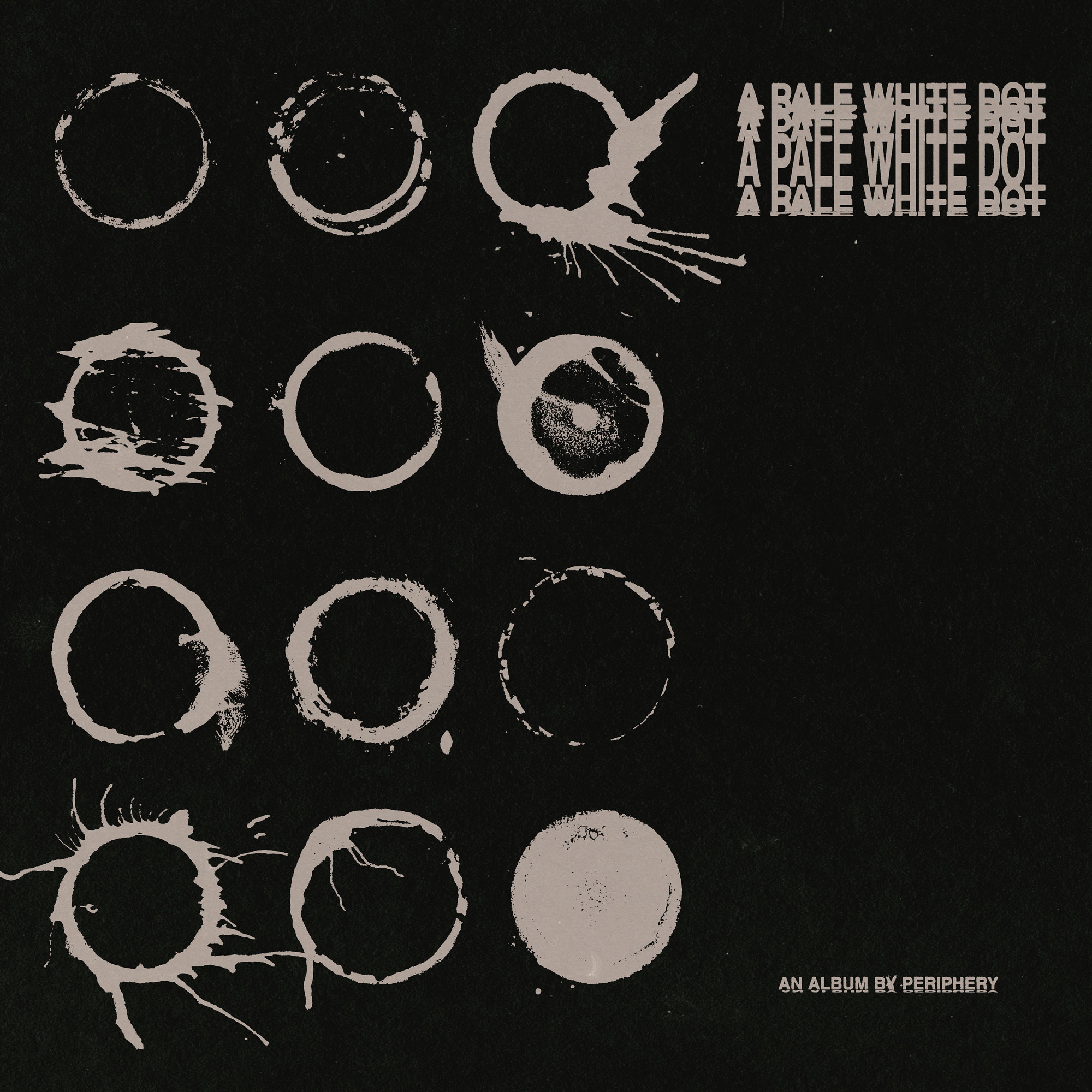
Art direction, design, and layout for Periphery's album A Pale White Dot.
Created before the album was fully written, the visual identity played an active role in shaping the project's creative direction. Each hand-drawn dot serves as an abstract interpretation of a song's lyrical themes, creating a visual language that evolved alongside the music itself.
As one of the most influential bands in modern progressive metal, Periphery presented a unique challenge: reimagining their visual identity while maintaining the connection fans had built with the band over the years. The goal was to push the project into new territory through bold, minimal, and unconventional design, while preserving the sense of depth, darkness, and authenticity that defines the band's legacy.
Client
Periphery
Year
2026
Deliverable
Art Direction, Design, Layout, and Merch